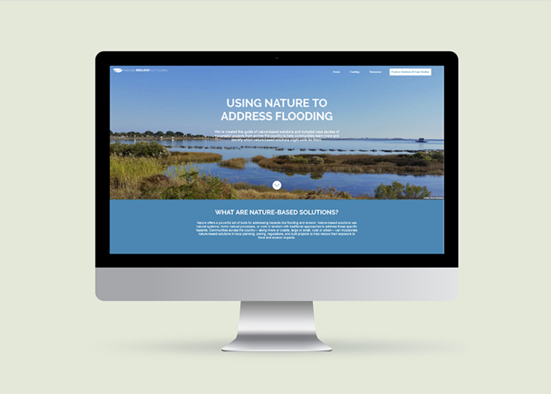
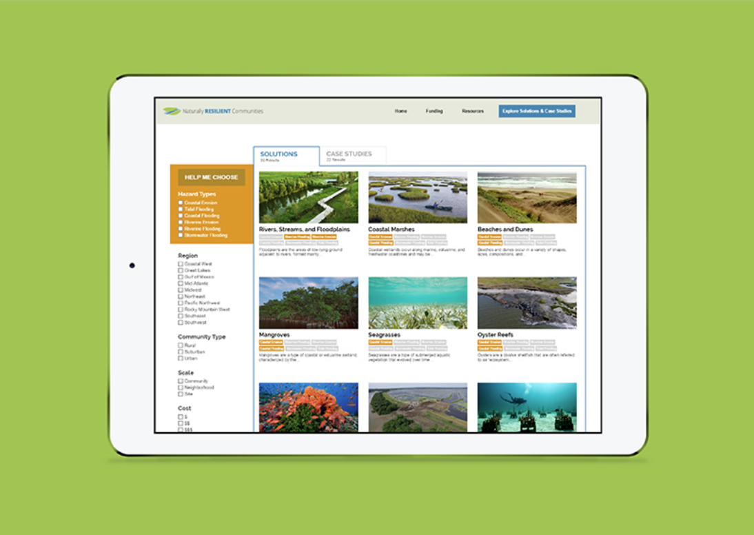
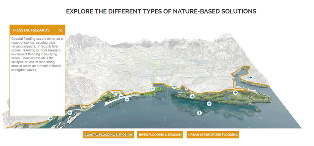
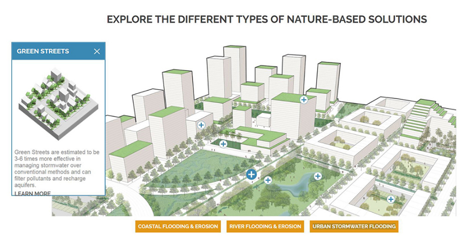
The Naturally Resilient Communities website is helping spread awareness of nature-based flooding solutions, and is the product of over two years of work by a large team of committed experts, including The Nature Conservancy.
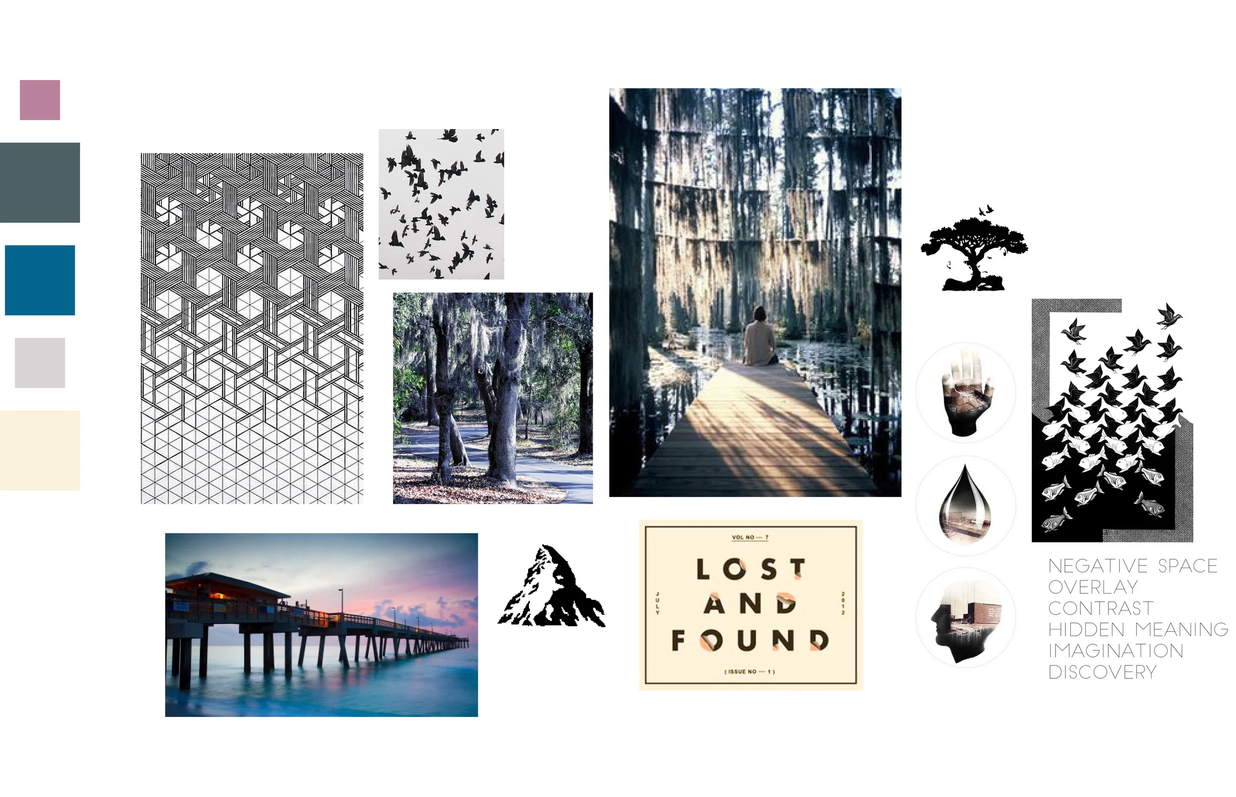
The branding for the site was driven by a desire to set an aspirational yet achievable tone. The approach was to let large, beautiful images of successful nature-based projects lead the visuals and inspire the user. Therefore image selection was an important part of the process. The images needed to be visually impactful as well as accurate to the solutions with which they were paired.
Greens and blues were chosen for the logo and the solutions and case studies. These color selections were made to convey the idea that water and nature could work harmoniously together to mitigate flooding. A strong orange was chosen for the other organizing element of the site, namely the site navigation and hazards. The consistent use of these colors aids the user in navigating the site effectively.
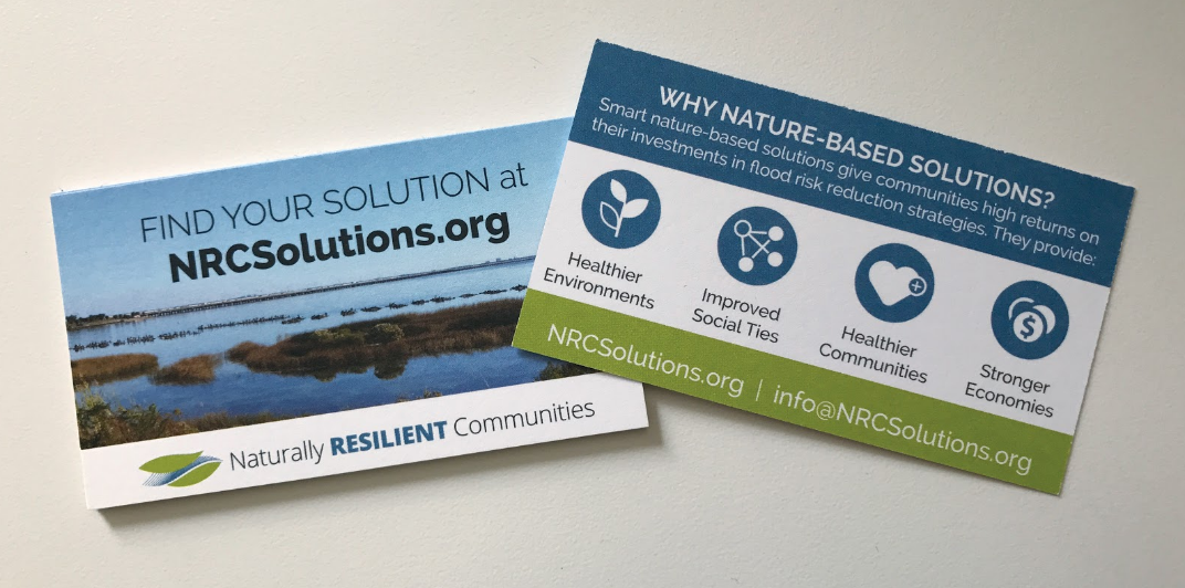
Two main branded elements were developed for the site: a logo and a set of icons. The logo was developed to promote the idea that nature could work symbiotically with water to deal with flooding. The shape is organic, with the water running fluidly through the land. Since the word “flooding” is not in the name of the initiative, the word “resilient” was bolded and made blue to suggest the idea of managing water. The icons were developed to stress the importance of the co-benefits of green infrastructure, a guiding principle of this guide and, more broadly, TNC’s mission. Like the solutions, the icons were colored blue to suggest the idea of moving forward with water.


